Over the past years, I always wait for Spotify to release its yearly Spotify Wrapped where I can see my most streamed artists and songs over the year. It’s been a trend over the years to post our Wrapped results on our favorite social medias. And, I for one am one of those people that impatiently post my results once Spotify releases its yearly campaign.
However, Spotify only releases its results at the end of the year. Over this year, I realized that I have been listening habits change a lot. I find new songs and I have a new favorite artist every week.
As a curious person and mostly driven by FOMO, I wonder what stories can my streaming data tell. What are my favorite artists or genres? Am I a pop guy or maybe an indie gal? How mainstream are I? Do I listen to sad songs for no reason at 3 AM?
Luckily, Spotify allows its users to download their streaming data of the past one year through their privacy settings. So, I did that and learned a few data visualization tricks. Here are some interest things that I found from my streaming history
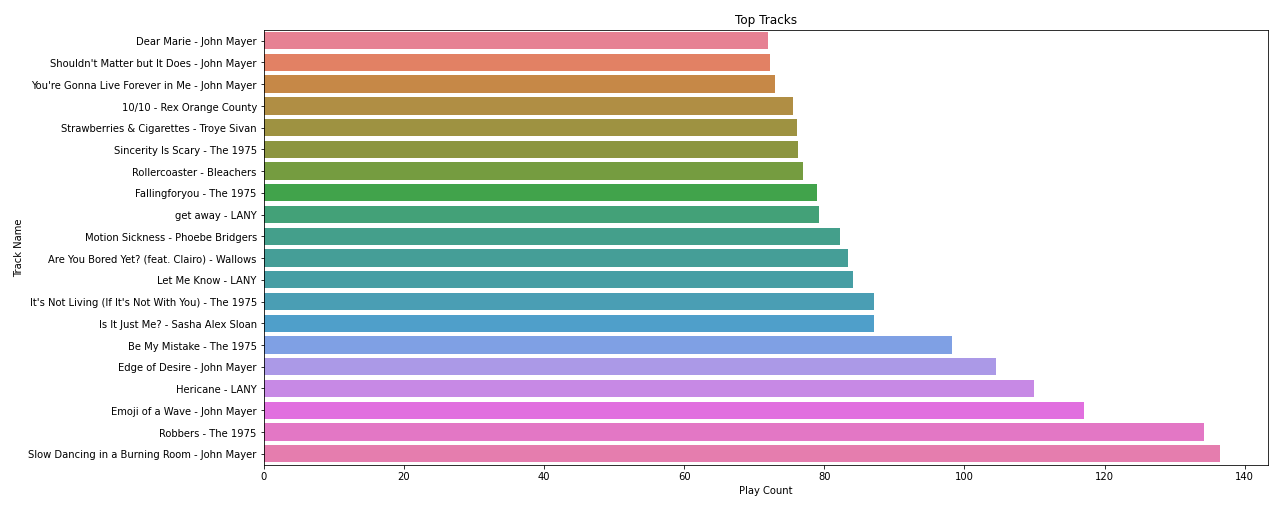
Here are my top 20 tracks of this past year. There are a few songs that cross the 100 times played. An average song is about 3 and a half minutes. So, in total, I’ve listened to each of those songs for almost 6 hours.
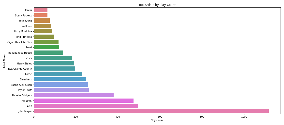
Now, here’s my top 20 artists. As you can see, I’m a big fan of John Mayer. Over a year, I listened to John’s Mayer songs 1116 times. My other top artistss are LANY, The 1975, Phoebe Bridgers, and Taytay!
Bar charts might be a little boring in visualizing data. There are other graphs that may tell more compelling stories. One of which is the treemap.
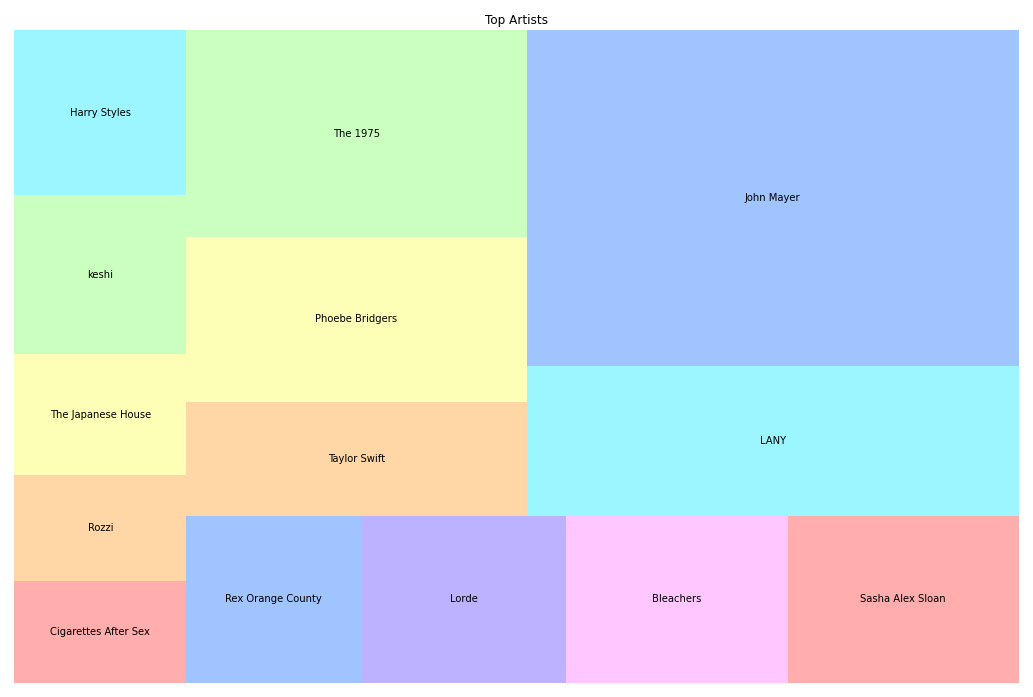
The size in the treemap represents the number of times I listened to the artists’ songs. It creates a more interesting visual of my favorite artists than just columns.
Aside from my favorite tracks and artists, I also gathered some info about my listening habits.
First off is my listening habits by hour of the day
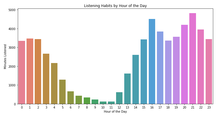
I’m more of a night owl where I like to cram most of my assignments at night. So, I tend to listen to more music at night. Especially in those fragile hours from 1 to 3 AM. Aside from listening habit by hour, there is also something interesting about my listening habit by day.
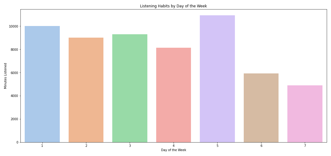
It turns out I mostly listen to songs on weekdays. Even though I feel like I don’t go out very often during weekend, it turns out that I listen to less music during weekends. Huh, interesting!
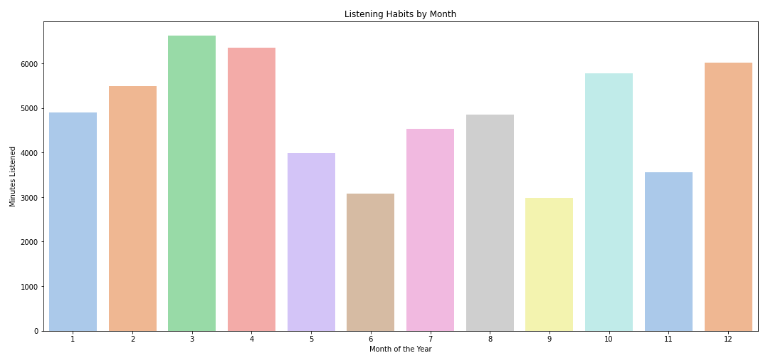
I listened to the least music during June and September 2021. Not really sure what caused that. But, I listened to the most music during my winter term in 2022 (Dec 2021 - April 2022). I tend to have a habit of listening to music while studying, so that explains the increase in streaming activity. And, listening to music in bed all-day is the best thing to do in winter. Right?
One other interesting find from my streaming history is that, most of the sad songs I listen to are in major scales.
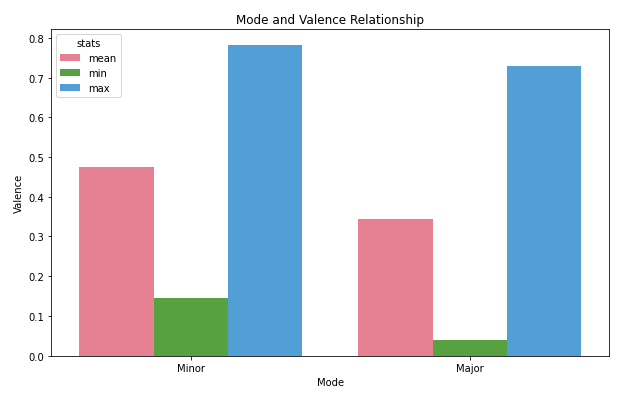
As a context, valence is the measure of music positiveness. Songs with cheerful melodies such as Niki’s Every Summertime have higher melodies (maximum of 1.0). Depressing songs such as You’re Gonna Live Forever in Me by John Mayer have lower valence (minimum of 0.0)
I used to think that most sad songs are in minor keys since minor scales tend to feel more ‘sad’-ish. But, turns out most of the songs I consider sad are in major keys; Emoji of A Wave by John Mayer, Be My Mistake by The 1975, From the Dining Table by Harry Styles, I miss you, I’m Sorry by Gracie Abrams.
There’s a lot of stories a few data can tell. Ever wonder what stories can be told from everyone’s listening habits?
In a more technical note, the data downloaded from Spotify provided me with a JSON file of my streaming history. Here’s an example of one of the objects:
{
	"endTime" : "2021-05-14 14:18",
	"artistName" : "John Mayer",
	"trackName" : "Slow Dancing in a Burning Room",
	"msPlayed" : 242000
}
From these streaming histories, I utilized pandas to create a dataframe and calculated the total time played of each songs. The grouped calculation produces my unique top tracks.
I also used the Spotify API to grab essential information of each song, such as duration and valence, using the Audio Feature endpoint. The additional data from the API are added to the initial dataframe for me to play around with.
With all these collected, I used Matplotlib and Seaborn to create the data visualizations above. I also tried Squarify, a package that helped me create the treemap graph.
As a first data visualization project, I learned a lot about manipulating dataframes and cleaning data. Hope I can create more data projects soon!